September 2021 - amended
This version contains a correction of a
bug causing THD to be shown incorrectly in the September version
Hot enhancement.
PlotXY has a feature called auto
tab-switch. With this feature, if the user clicks on a Plot or Fourier
Window the corresponding tab in the DataSelectionWindow
becomes the active tab (see the third paragraph of Management of the plot windows.
Unfortunately, in previous versions
a correct tab switch occurred only if the user clicked on the header of
the plot windows. If, instead, he clicked on the plot area, after a few
switches, auto tab-switch did not occur anymore.
Fixed.
PLOTXY - A scientific plotting and post-processing
program
2 What PlotXY is and what can do for you
3 Getting to know the main windows and giving names to buttons
4 Doing the first things: a “real-life” experience
5 Doing some activity using the provided files
5.1 Loading a file and doing first things
5.2 Making, evaluating and managing line plots
5.6 Zooming and keeping zoomed
5.7 Special plots: with twin vertical axes or
X-Y plots
5.8 Modifying the plot scales and units of
measure
5.9 Changing the plot type and appearance
5.10 Using several program windows
5.11 Customising plot line colours and type
6.3 Creating and managing Fourier Charts
7.2 Saving Fourier chart settings
7.3 Automatic loading of files.
7.4 Customizing the program behaviour
8.2 Exporting selected variables into a new data
file
8.3 Exporting plot into system clipboard or
SVG/PNG
9 How to use with OpenModelica
9.3 Fast update of PlotXY display
9.4 Combination of variables (Function Plots)
10.1 Management of the plot windows.
10.2 Automatic determination of scale span
10.3 Automatic Units of measure and prefixes
1
About this tutorial
This tutorial shows the basic operations to obtain the first plots from PlotXY. It shows also nearly everything you will need to make also more complex operations with the program.
Please consider that the maximum efforts have been done to make the program as intuitive as possible, therefore the learning curve should be very steep. I imagine that the duration of this tutorial for you will be around 30 minutes.
The figures shown have been made using the Microsoft Windows version of the program. Under Apple Mac they are slightly different but the elements (buttons, tables, etc.) are exactly the same. Therefore any Mac reader will be as comfortable as Windows users in following this tutorial.
This tutorial is intended for sequential reading. However, in case you strongly want to, you can jump to any of its sections by clicking on the links in the Table of Contents.
2 What PlotXY is and what can do for you
I propose here just a few Q&A’s.
What is PlotXY? It is a program to make plots and post-processing of simulated and measured data, specifically designed for scientists and engineers.
What are the PlotXY strengths as a plotting program? It is built from the ground up having in mind serious scientific usage. For instance:
1) it is at ease with very large data: it loads easily files of large size (tens or hundreds of MB), and plots very fast variables having many samples (several thousands or even hundreds of thousands).
2) It manages effectively the scientific prefixes (“k” for “kilo”, “M, for Mega”, etc). If input data contains the relevant information, it uses the correct unit of measure (“A” for ampere, “V” for volt, etc.)
How PlotXY interacts with my other favourite programs? This program is able to read data from the well-knowns ATP simulation program, as well as from asci files (both its own “ADF” format and common versions of CSV files). For instance it reads smoothly CSV files created from the Modelica simulator OpenModelica (www.openmodelica.org). It can export plots into SVG, PNG, PDF formats.
What kind of post-processing is possible? You can make any kind of algebraic operations among the variables read from input files. You can also make the time-integral of a variable. You can also compute and plot the coefficients of the Fourier polynomial of a variable.
It the program free? Yes, it is completely free. It is distributed under the open source LGPL license.
3
Getting to know the main windows and giving names to buttons
Before starting to do things, better is to become acquainted with the three program main windows, and to give names to their buttons.
3.1
The DataSelection Window
Once PlotXY is
started, the first window to appear is the one shown below, that is the main
program window.
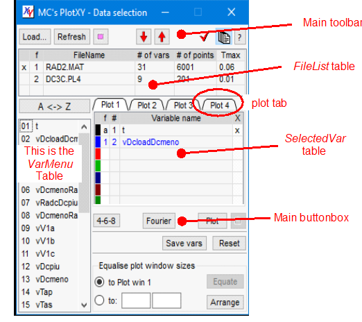
Below you can find specific names of the toolbar tools
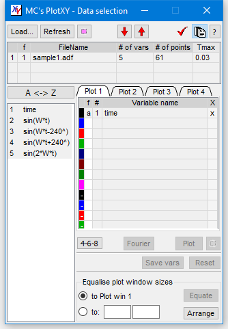
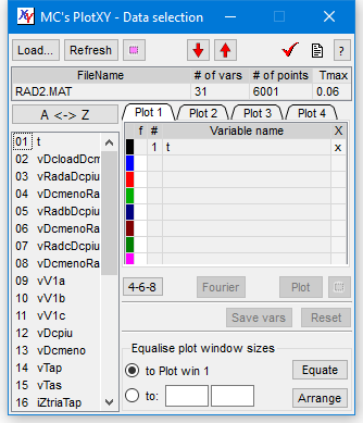
The FileList Table is self-explanatory. Some explanation of the SelectedVar table columns is needed instead:
· Column “f” contains the file number. In the example above we have two files; the “u” corresponding to vDcloadDcmeno indicates that this variable comes from the file number 1. The variable on the horizontal axis, here “t”, must be in common with all the considered file, that’s why in the ”f” column, “t” row, we find the indicator “a”, which stands for “all”.
· Column “#” contains the variable number inside the considered file. Here vDcloadDcmeno is variable n. 2.
· Column “X”. This letter stands for “aXis”. In this column, we find a “x” on the variable to be put on the x-aXis, a “r” for variables to be plotted against the vertical y-aXis in case of twin vertical axis (see sect. Special plots: with twin vertical axes or X-Y plots”). If nothing is written on the “x” column for a variable, the default, i.e. left-y axis, applies.
3.2
The Plot window
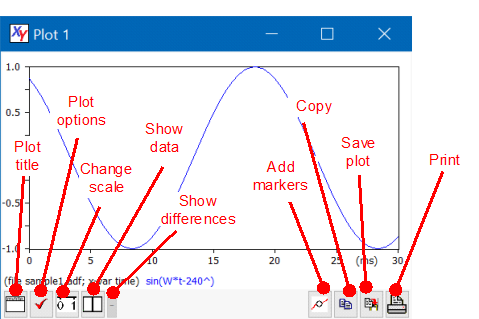
When, in the Data Selection window the plot button is clicked, the plot window is displayed.
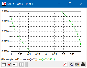
It has the appearance shown in the picture aside (in which a simple plot from the supplied file “sample1.adf” is drawn), where names of the toolbar buttons are also given.
3.3
The Fourier chart window
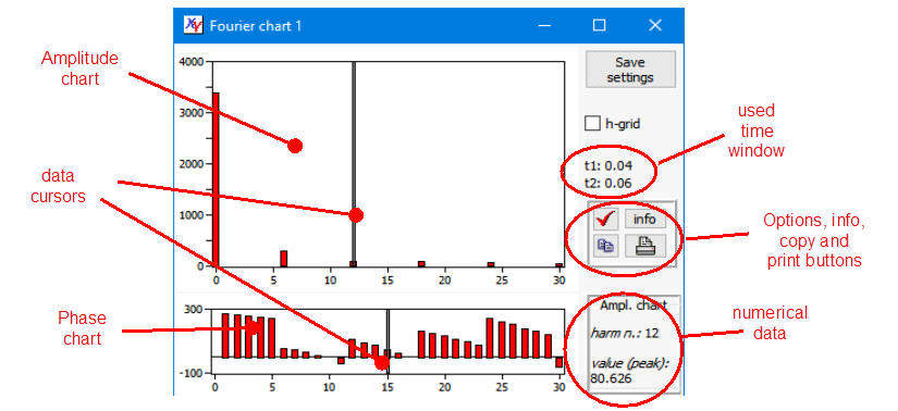
The program is also able to make Fourier analysis (more precisely the i.e. Discrete Fourier Transform - DFT) of periodic signals and to display the corresponding amplitude and phase spectra. This is done using the Fourier Chart window, that is shown below along with the name of its main elements.
4 Doing the first things: a “real-life”
experience
The first thing to do is to load one or more files. Here I show how it works using my own files, just to give ha hint about a real-life experience with the program. In Working together using the provided files, instead I will propose actions that you can repeat using the sample files provided.
There are two ways of doing this:
1. Using the Load… button
2. Using the drag&drop feature of the operating system: looking at the file name in their own directory, selecting one or more of them, and dragging them onto the main program window.
Once some files
have been loaded the main program window can for instance have the appearance
shown below at the left side of the figure (three files) or at the right side
(seven different files).
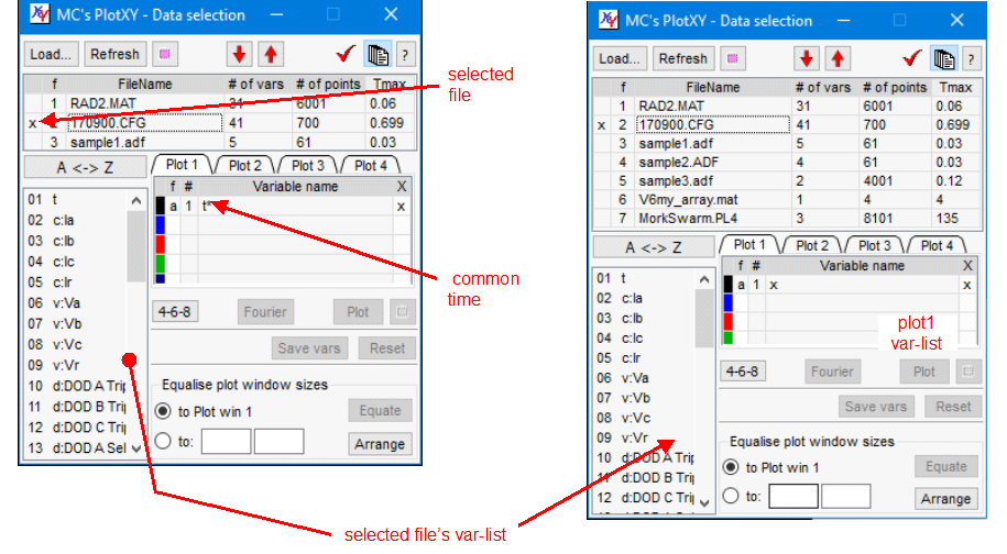
Note that the program automatically selects the first variable as the “x variable” (the one that should by default correspond to the horizontal axis). If all the loaded files share the same name on the horizontal axis, this one will be chosen.
If all the first names begin with the same first character a name containing that character and ‘*’ will be used. For instance, if all the variables begin with ‘t’ we will have a “common time” variable indicated ad “t*” (see figure left above). Note that based on the first character the horizontal variable will be attributed a unit of measure, according with the following convention:
- Names beginning with ‘t’ will be treated as being time (unit of measure is second)
- Names beginning with ‘f’ will be treated as being frequency (unit of measure is hertz).
It the first names in the selected files var-lists do not have all the same first character, the program gives to this common variable the name “x” and gives up trying to understand which unit of measure it might have,
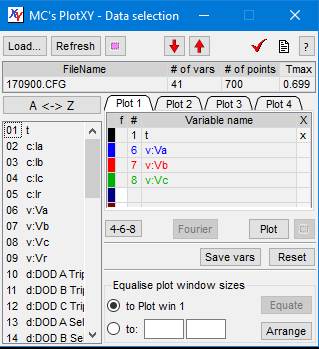
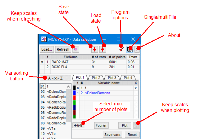
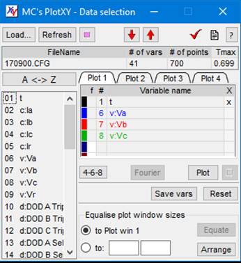
There are times, however, in which the user wants just to deal with a single file. In this case he can switch to the single-file mode, simply by clicking on the second rightmost button on the main toolbar. This way he will save valuable screen space, and have some additional features that are available only in single-file mode.
Switching into singleFile mode does not unload any of the already loaded files. When I clicked on the second right-most button of the toolbar from the situation shown in the right window just above here, I got the appearance shown aside (I have also reduced the window’s height by acting as usual on resizable windows).
Now it is time to select and plot variables.
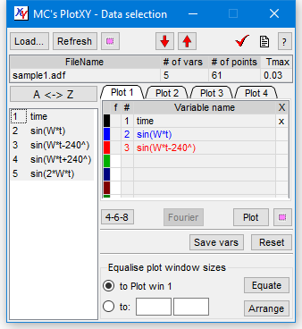
From the figure aside we now select (by clicking onto the respective names) variables #2, #3, #4. The window will now appear as shown below at left.
Once the variables have been selected, they can be plot simply clicking on the “Plot” button. In my example the window shown below at right appears.
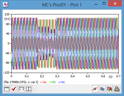
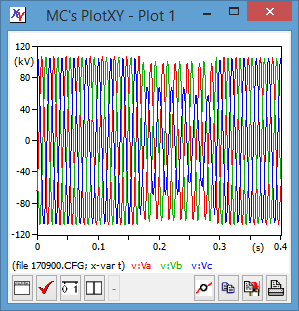
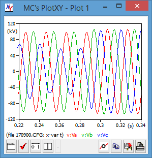
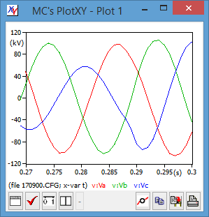
As often happens, in this case the plot is too cluttered to see details. However, it is very simple in PlotXY to zoom: simply click and drag. To zoom out, right-click and choose whether zoom just one step or totally. Below three progressive zoom levels of the same figure are shown in three windows that, for compactness have been previously horizontally shrunk.
You might have noted a few characteristics of the plots that are produced:
1) Minimum and maximum numerical values on the axes are always “round” numbers. Indeed a rather sophisticated algorithm is present inside do avoid nasty numbers on the axis such as 1.2345 or 100000 or 0.000001
2) The unit of measure of the quantities is automatically set to kV. This is based on the variable names. If the auto-naming feature is not disabled, all variables whose name begins with “v” is taken to be a voltage. Also, time is acknowledged as such and its unit set to seconds.
The rules used for auto-setting of units of measure are as in the following table:
|
First character of name |
quantity |
First character of name |
quantity |
|
“t” |
time |
“a” |
angle |
|
“v” |
voltage |
“p” |
power |
|
“i” or “c” |
current |
“e” |
energy |
When these units of measures are used, also the standard prefixes are used as well (e.g. u for “micro”, m for “milli” k for “kilo”, M for “Mega”, G for “Giga”, etc.).
Now that you have a first idea of how the programs work and how the produced plots look like in a real-life case, let us make together some plots step-by-step using the enclosed sample files (from sample1.adf to sample3.adf).
5 Doing some activity using the provided files
5.1
Loading a file and doing first things
If you have gained
access to this tutorial, I
can assume you have already installed the program and understood how to launch
the program.
However, to launch the program the best way is to use a link you have
created linking to PlotXY.exe (that you’ve put in a directory of your choice)
and click on it.
When the file is loaded, you have two options to load a file (either using the button (Load…) or dragging a file onto the PlotXY window from the directory where it is.
Once you have loaded the program and loaded sample1.adf the program window looks like the one shown aside.
Since the file is compact and just one, we can reduce the window size to reduce its space occupation on the screen. To reduce the window size se use the usual way for resizing windows in computers using the window‘s borders.
Moreover, we choose to display in the file table only one file we click on the Single/multifile button in the main toolbar
|
|
The corresponding windows will now look like as shown
aside: the window is much smaller and saves much of your precious desktop
area. If you have many variables you might find it useful to sort
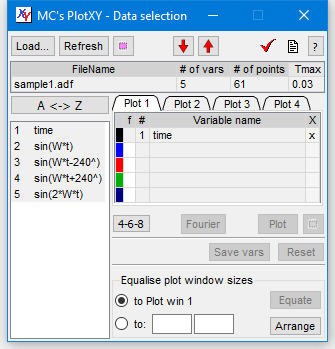
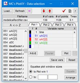
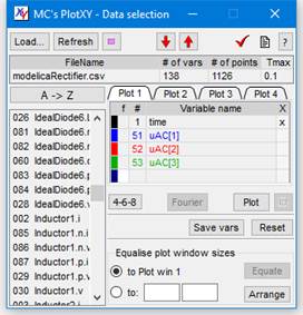
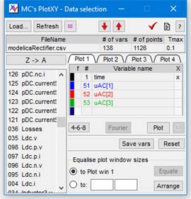
them alphabetically in ascending or descending order using the Var Sorting button (three pictures
below). When A<->Z is displayed the variables are listed in the same
order in which they appear in their input file. Note that sorting does not change the number attributed to
each variable: for instance the
selected variables remained variables N. 51, 52, 53. |
|
|
|
|
|
Naturally, if we commonly use small numbers of files and
variable and plots, we want to use small program windows ad default, without
having to resize it anytime we load the program. To do this, we can set the
option “remember windows’ positions and sizes”. The program options are
accessed clicking on the third button from the right in the man toolbar
showing a check-mark as symbol. |
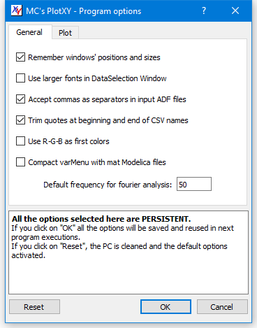
Several program options can be set. Here I did show just the one interests us
now. Note that the program settings are written as system settings in a region
of the computer storage space the operating system chooses. Under Microsoft
Windows it is the Windows’ registry.
Although I don’t advise this ;-) you might want to remove the program from your hard disk and leave the computer completely clean. To do so, you have to open the program options window and click on the “Reset” button.
5.2 Making, evaluating and managing line plots
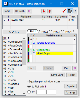
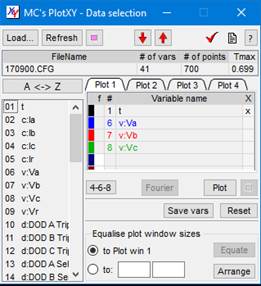
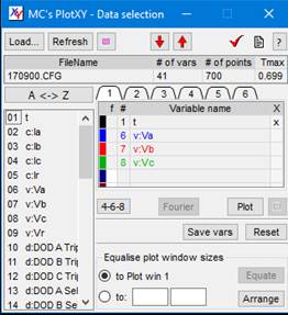
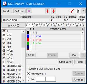
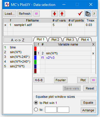
Now we want to select a variable and show its plot. To select a variable you can click on its name in the VarMenu table, or drag &drop it in the SelectedVar table. In the first case, the variable will get the first available colour, in the latter you can choose the variable colour by choosing the appropriate row.
In the figure left below a few variables from the supplied file rad2.mat re elected by clicking on their names; in the one at the right side their names are dragged and dropped, so that the wanted colours are used (the last dropped has a yellow background). The plots will have the same colours as the shown variable names..
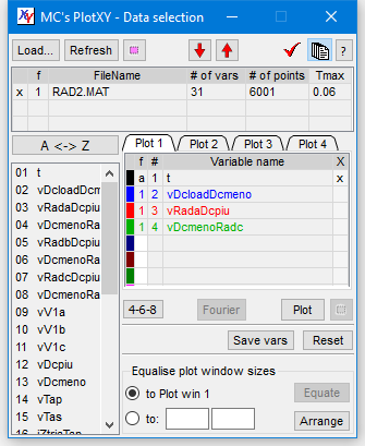
You can also
select several adjacent variables at a time: a group of variables. You have to keep the shift key down while
clicking on the first (the uppermost) variable of the group, and then click
normally on the last one.
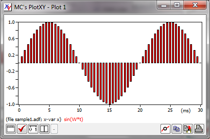
Once one or more variable(s) is (are) selected, click on the “Plot” button to see the plot. Two examples from file sample1.padf are below: please reproduce them as a very simple exercise.
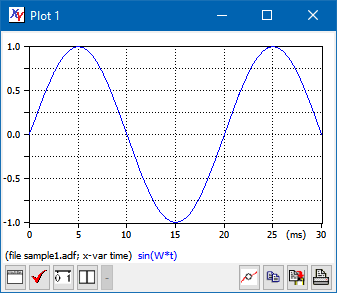
We see that the plot contain also a legend (shown below) containing the variable names.
You can zoom the produced plots at will, as we’ve learned in the Doing the first things: feel a real-life experience.
Now we perform additional actions.
5.3
Looking at data values
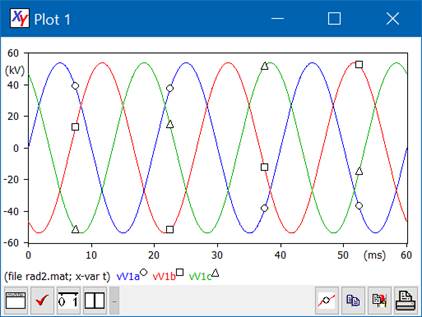
Consider the plots in the right picture here above. We now want to see some numerical values.
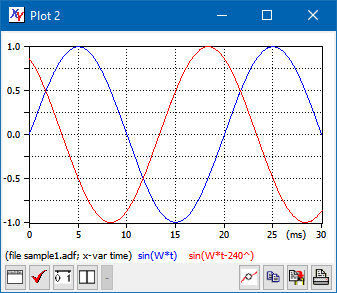
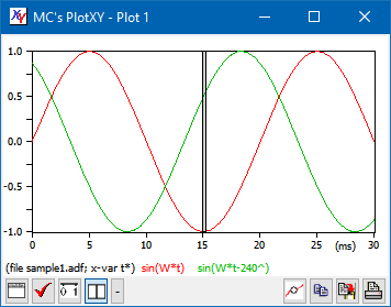
PlotXY offers two ways to do this. The first one is putting the mouse cursor near the curves. The program will find the nearest point in file and show the corresponding value on a tooltip box. Moreover, a small red rectangle indicating what point the value exactly refers to. This is particularly useful when considering plots with only a few points and therefore the actual point on file might be rather far from the mouse pointer. See the two examples below:
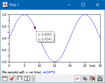
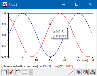
Another option consists of having simultaneous access to all the values corresponding to a given x-axis value. To do this, click on the Show data button. What happens in the cases of a single curve or multiple curves is different. Try! You will get something like what you can see down here.
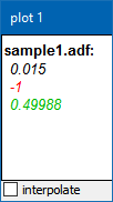
In the left window the values are directly shown in the bottom toolbar
(time first), while in the right one, because more space is needed, an
additional small window (the Data browse window) is created to show the numerical
values. In the first case the number of significant digits used to display the
values is 4, in the second case it is 5. However, if Exact match is selected in the scale window (see Modifying the plot scales), in both cases the number of significant
digits is rised by one, thus becoming 5 and 6, respectively.
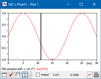
In both cases normally the numbers shown are exactly those present in the
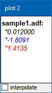
inpt file; however, if the “interpolate” box is checked, linear interplation is
made between adjacent points, check sample1.adf file: you will see that
corresponding to t=0.0105s the sin(Om*t) value is -0.1563.
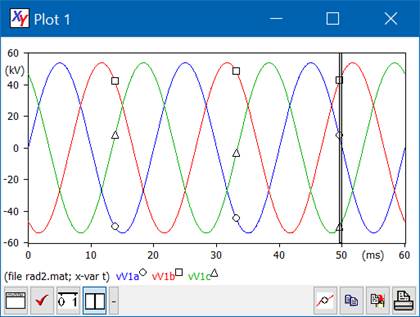
In case you want to see the difference of the values one or more cuves
have at different points of time, you can click on the Show differences button. It is located immediately at right of the show data button, and carries a sign “-“ on it . You will get a second vertical bar
such as in the two images below. Whenever you move the grey bar you get actual
values; whenever you move the green one, you will get the differences
(difference values are marked with an asterisk “*” at the left side of the
numbers). As before, in case a single plot is shown the numbers are shown in
the Plot window, otherwise in a separatate, small additional window.
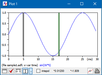
Hint: you can move cursors using arrow-keys on keyboard instead of mouse. Simple left and right arrows move by one pixel left and right. If CTRL button is hold down when using arrows, movement is faster (three pixels per keypress).
For info about looking at data values when “functions of variables” are used, see sect. Function plots.
5.4 Add markers
Sometimes one needs to have a multi-curve plot clearly understandable even when printed on a B/W printer.
This can be done using the Add markers Button of a Plot Window.
This button has a different behaviour when the Show data button is up or down.
When it is up, four markers for each curve are added in automatically determined positions of the plot (see left picture below). If, on the other hand it is down, and therefore the vertical grey bar is visible, they are added in the bar position. Therefore, moving left and right that bar, the user can chose the best position for the markers. This way he can add as many markers as he wants. (See right picture below).
5.5 Adding a plot title
To add a title to the plot, simply click on the “Plot title” button in a Plot window.
5.6 Zooming and keeping zoomed
Very often, we need to have a closer look at some plot detail. To do this we want to zoom the plot. The display of a title can be toggled using the same button.
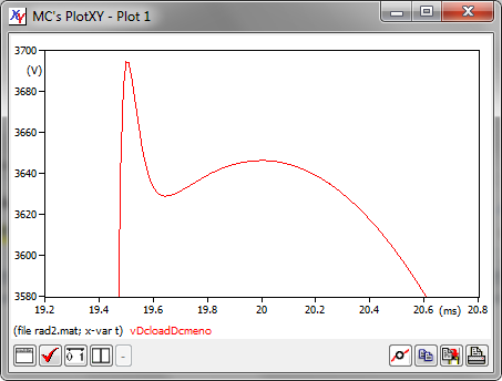
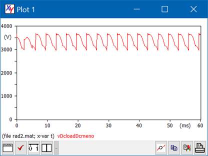
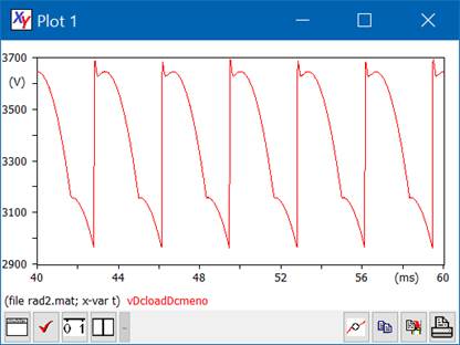
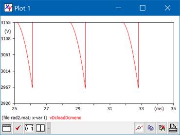
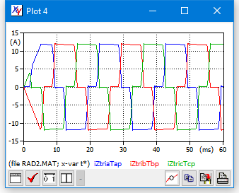
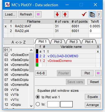
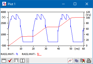
This is straightforward with PlotXY: simply we define the zooming rectangle with the mouse: we push down the left button in the top-left corner of the rectangle, drag the mouse, and leave the button once the rectangle displays what we want. While dragging the selected area is in partly transparent pink that shows what we are selecting. See the two pictures below: the left one shows zooming in action, the right one shows the zoomed plot. Try to repeat this using the supplied file rad2.mat.
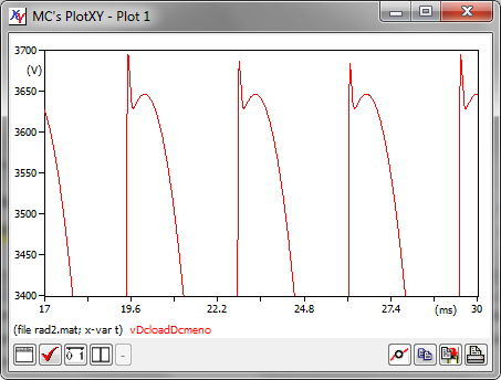
We can repeat this many times, to have a look at even tiny details of our plots. See below.
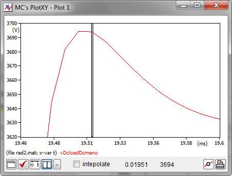
In a zoomed plot we still can look at the numerical values corresponding to the plot, either focusing on the actual data from the loaded file, or on an interpolation between points (see the right picture above).
Whenever a plot is zoomed, the axes are kept clean: we have “round numbers as minimum and maximum values and on the tic-marks. Only when the zoom is very deep, PloXY gives up choosing clean axes and use whatever it can.
To zoom out, right-click on the plot area: we will have the choice between getting back one level or zoom out the plot completely.
It might also be useful, in some occasions, to add or remove plots from a plot window without updating the zoom range.
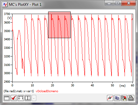
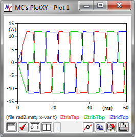
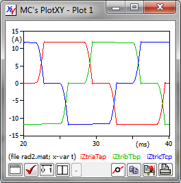
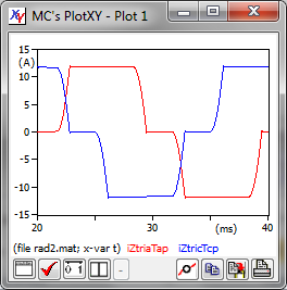
Let us do together an exercise. From rad2.mat we can plot variables 16, 17 and 18. The plot will appear as shown below at left. Then manually zoom between 20 and 40 ms. The resulting plot is shown below at centre.
We might now add or remove curves while leaving the axes range unchanced
(between 20 and 40 ms horizontaly, and betweeen – 15 and 15 A).
This is done by clicking on the Keep
scale ranges while plotting button
(on the main buttonbox of the DataSelection Window) before clicking on the plot
button. If that button is down, the axis scales are left unchanged. Therefore
if for instance we remove variable N. 17, and then we plot keeping scales, the
plot is as shown at the rightmost picture below.
5.7
Special plots: with twin vertical axes or X-Y
plots
Rather often the best visualisation is when two different plots are built using the same horizontal scale but they have different vertical sizes. In these cases it may be very convenient to realize plot with two different vertical axes (here called twin vertical axes).
PlotXY allows you to create plots with several curves, while allowing you to select which one corresponds to the left vertical axis and which correspond to the right one.
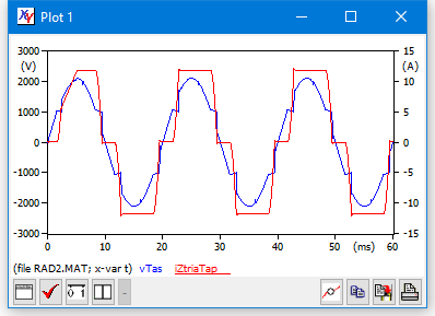
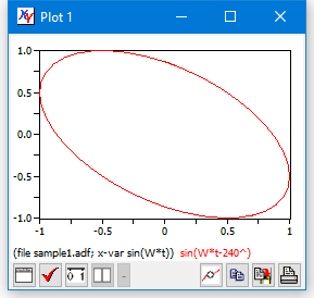
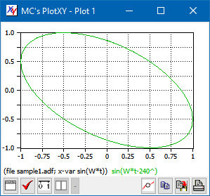
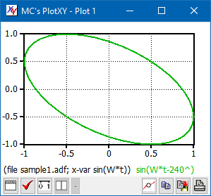
This can be seen using the enclosed file sample2.mat.
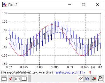
The figures below show what happens if we select a voltage (variable vTas) and a current (iZtriaTap) as variables to be numerically evaluated against the left and right vertical axes respectively.
The first variable has been selected by left-clicking on its name, the second one right-clinking on its one. In the plot window we can easily understand with variables refer to the right vertical axis: their name is shown underlined.
Note: You can also right-click on the name of an already selected variable to toggle between left and right vertical axis usage for that variable.
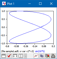
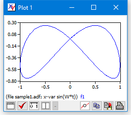
Another useful feature is the possibility to plot a variable against another.
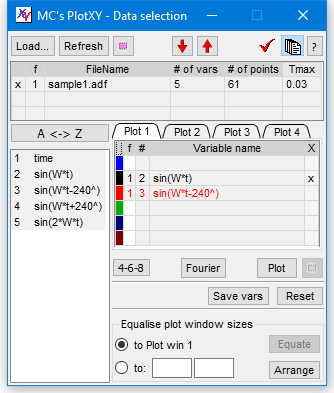
This can be done only from SelectedVar tables were the selected variables come all from the same file. To make X-Y plots:
1. select the variables of interest and
2. click on the “X” column in tie plot var-list of the dataSelection window.
When step 2 is performed, the row onto which one has clicked becomes the “x” variable for X-Y plots. When this step 2 is performed for the first time after the latest reset of the Plot var-list table the previous x-var is removed from the table, assuming that it represents time, and therefore it is not whished. In case of subsequent clicks, however, the old X variable is not automatically removed and becomes one of the y variables of the X-Y plot.
5.8
Modifying the plot scales and units of measure
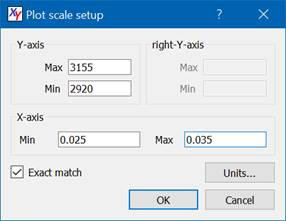
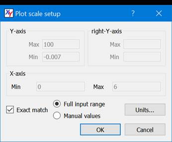
We have seen that PlotXY tries to automatically find the most reasonable and readable scales on the axes. Nevertheless, the user often wants to select min and max values himself. This can be done clicking on the Change Scale button of the plot window. This will cause the left window below to be displayed:
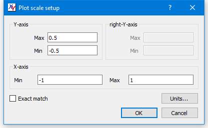
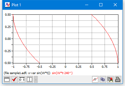
If one clicks on the ok button, the scales shown in the left plot are used.
If “Exact match” is not selected the given Min and Max are still subject to adaptation by the program to ease readability, otherwise the exact scale ranges chosen by the user are used. Compare the following pictures:
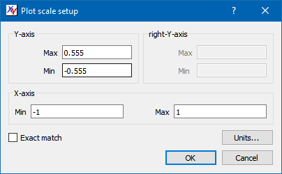
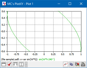
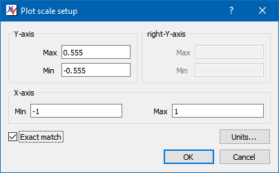
When Exact match is selected, the number of significant digits used to display values with data cursors (see Looking at data values) is raised by one and brought to 5 or 6, depending on whether the numerical values are displayed in the Plot window or in the Data browse window (compare sect. “Looking at data values”). This because it is intended that when the user requests Exact match, he wants more precision everywhere.
From some examples above, the reader might have note that the program tries to show reasonable unit of measure on the axes. For instance, variables starting with “v” are interpreted as being voltage, and the chosen unit of measure is “(V)”. This automatic determination of units of measure has important features, which are described in detail in section “Automatic Units of measure and prefixes”. Here I just want to say that the user can manually select his axis labels, clicking on the “Units…” button of the “Plot scale setup” window shown just above here.
When the user clicks on that button, the following Units dialog is displayed.
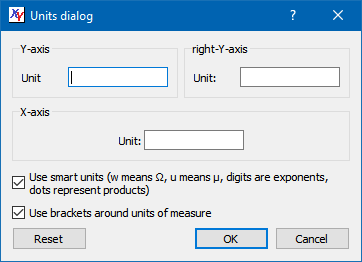
It allows selecting the units for any of the three axes.
When the first checkbox is selected units can be SI compliant. For example it is easy to produce units such as m, Nm, N.m, N/m, W, Wm, mF, N/m2, N.m-2. To write these units, write “w” to get W, “u” to get m; any digit is interpreted as being an exponent (possibly preceded by a sign), any “.” as a dot indicating product. It may happen that the user wants to use a non-SI compliant unit of measure, such as “p.u.” To do this, it is necessary not to use smart unis, unchecking the first check-box. Thus avoiding the special interpretation of dots and character “u” necessary for smart units.
If a new plot is created using the “Plot” button on the DataSelection window the units selected in the units dialog are not used for it: they might be obsolete! If, however, before clicking on “Plot” the user selects the “Keep scale ranges while plotting”, since scale ranges are kept, it is obvious that also the units of measure are expected to be correct, and existing user units are therefore used.
Note that the unit of resistance ohm can correctly be displayed as a Greek uppercase omega.
5.9 Changing the plot type and appearance
In the previous section, line plots with linear scale on the axes were shown.
Naturally, there exist several options to change the appearance of the plot. To explore them, try to click on the Plot options or Change scale buttons.
Click for instance the Plot options button. A window like the ones shown below appears. The window has three tabs displaying different options each. The meaning of the options is self-explanatory.
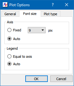
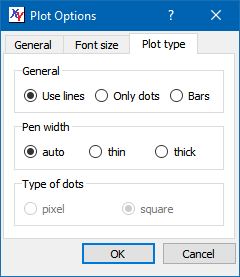
Two examples of the application of some plot options are shown below:
General|Display Grid (left), Plot type|pen width|thick and Font size!axis!dixed
12 pts (right).
When you use a log axis, the marks on the axes and gridlines will be at 2x, 4x, 8x the main power of ten.
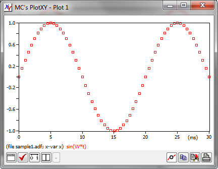
There are cases in which line plots are not the best way to show a plot. If we want to see only the point read from file we can use General|only dots option. This is done in the bottom-left plot for the first variable from sample1.adf file.
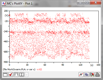
Finally there are files in which the X-Y correlation is weak; this can be shown using a cloud of points. In this case small squares to show points are too large, and it is better to use single pixels. This is done in the bottom-right plot, using variable X2 from the MorkSwarm.pl4 file
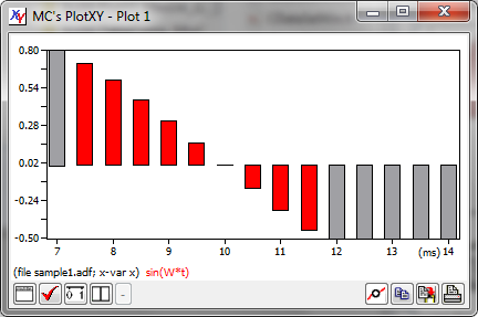
There are also cases in which instead of line plots the user needs to use a bar chart. This is done in the bottom-left plot (from sample1.df) in full scale, and in the bottom-right in a zoomed fashion. The bars whose second end falls outside the zooming window are shown greyed..
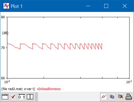
Finally scales can be linear, log, and dB. Two examples from sample2.mat are shown below
The customisation you do using the Plot Options button are valid for the current plot. The default graphical characteristics of the plots, e.g. those valid when plots are first created, decided at program level, using the Program options button of the program main window.
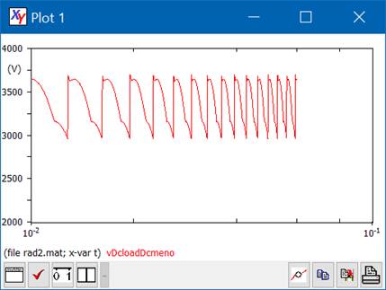
The Change scale button allows to manually change axes scales: this allows more flexibility than zooming: you can pan or choose detailed scaling. In the bottom-left plot the variable vDcLoadDcmeno is shown between 0 and 400 V, overriding the default scales.
In the bottom-right zooming on the horizontal axis is made.
Normally the user selected scales in the Plot scale setup dialog are subject to some refining by the scale determination inner engine to allow easy numbers on the numerical tic marks. If, however the user wants total freedom in choosing minimum and maximum values of an axis, he can attain this checking the Exact match checkbox. See the example below.
5.10 Using several program windows
Starting from the same files and variables you can show plots in different windows. Each window has its own setups, line style, scale, data-browse window, etc. A four-window example is shown below.
In case the users need more windows, he can use the “Select max number of plots” (indicated as “4-6-8”) - button, to rotate between three different maximums plot windows: 4, 6, 8. The appearance of the DataSelection window becomes as shown below
5.11 Customising plot line colours
and type
PlotXY, buy default, selects solid lines for curves. The colour can be easily chosen by drawing curves in the SelectedVar table row carrying the desired colour.
However, more customisation is possible. By clicking on any of the coloured boxes in the SelectedVar Table, the Customise palette window is displayed, which has the appearance shown below:
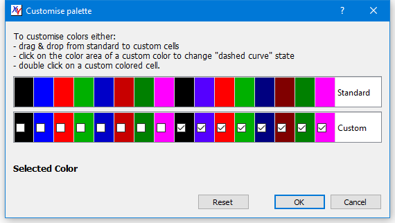
The instructions on how to use this window are displayed. Custom colours having checkbox checked will produce dashed curves.
The text “Selected Color” will be displayed in the colour which has been selected buy clicking in any coloured cell of the Standard row.
Additional comments on these windows are in sect. How to use with OpenModelica.
6 Postprocessing
PlotXY, in addition to plotting data from files, allows some post processing: finding the Fourier polynomial and making the corresponding bar charts, and creating new variables that are algebraic combination of others, or integral of others. These capabilities are discussed in this section.
6.1 Shifting time
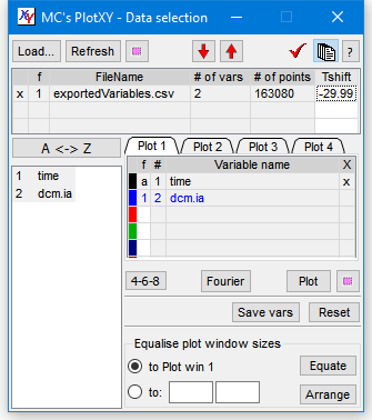
In some cases, especially when we want to align in time measured and simulated curves, we want to add some offset to the time scale of one or more files. This cam be done clicking on the cell named “Tmax” on the FTable of the DataSelection window. Once that cell is clicked, the situation changes, and “TShift” field is shown in place of Tmax. Furthermore, the corresponding cells get a white background, to indicate that they can be written.
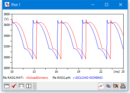
In the example shown below two files different in name but containing the same data are used. Rad2.mat, is retarded by 0.5 milliseconds and the result is shown in the plot at the right side of the DataSelWindow below.
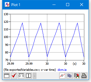
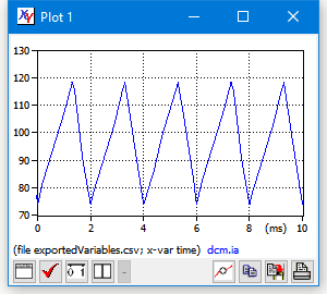
Another situation when shifting time might be useful, is when we want to zoom deeply at the right region of a long simulation. In case zoom is so deep that the tics numbers on the axes are all or nearly all equal (considering that the number of digits to display them is limited) understanding of horizontal axis is tricky. In this case shifting can solve the issue, as shown below: we need to have a close look at the last 10 ms of a long simulation lasting 30s. In the plot without time shifting the horizontal scale is hardly read; in the below plot, where we have shifted time so that the positive numbers are just the final 10 ms, the horizontal scale is perfectly understandable.
6.2 Changing time unit
The user can change time unit from second to hour, to day, to second.
To obtain this behaviour right-click on the time variable in the SelectedVarTable.
6.3
Creating and managing Fourier Charts
Electric and sound engineers use a lot Fourier decomposition of periodic waves.
Any periodic wave
can be considered written as: as ![]() . PlotXY determines coefficients
. PlotXY determines coefficients ![]() (
(![]() inclused) and
inclused) and ![]() . The quantity
. The quantity ![]() is internally inferred
from period T, which is t2-t1, where t1 and t2 are the extrema between
which Fourier coefficients are to be determined.
is internally inferred
from period T, which is t2-t1, where t1 and t2 are the extrema between
which Fourier coefficients are to be determined.
The analysis, starting from January 2020, is made through non-uniform DFT algorithm is used, so now it is not required to have constant sampling interval to perform correct Fourier charts.
Fourier charts are made considering a time interval t1¸t2 specified by the user or automatically determined as specified below. The first considered sample is the one immediately after t1, the last one immediately after t2 if exists, otherwise the last sample.
To make a Fourier chart only one variable must be selected. Then, simply click on the “Fourier” button. The program will try to choose the best parameters for general usage. In particular, it assumes that the simulation, after a possible initial transient has stabilised. Therefore, using the default frequency (that can be selected by means of the Plot Button of the DataSelection Window) it uses the last period of the available data to make computations.
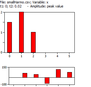
Take for instance the following pictures, obtained using the supplied smallHarmo.csv file. It contains data generated from the following equation:
x = 1.5 + 2 * sin(2 * pi * 50 * time + pi/3) + sin(4 * pi * 50 * time + pi/4);
Note that the phase chart has meaning only for the non-zero components, , and shows correctly 60 and 45 degrees respectively.
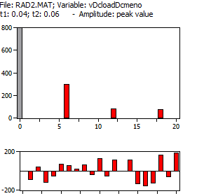
The following example, instead, is from the supplied rad2.mat:
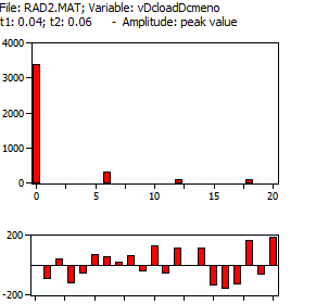
Here the default frequency is 50 Hz and the simulation goes from zero to 0.06 s, it will use as default the last twenty-millisecond period, for the analysis.
Once the chart is shown, you can move around the data cursors to see numerical values in the bottom-right part of the window.
You can zoom the chart. An example is shown below (on the left). The bars that fall into the plot are shown as usually in red (bounded by black rectangles), while the bars that are higher than the available vertical space are shown greyed.
6.3.1 Customising Fourier charts
The Fourier Chart can be customised in several ways clicking on the Fourier Options button. The window that appears has the aspect shown below.
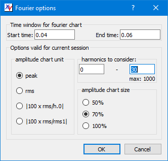
Note that the numerical values can be shown in the Fourier Chart window in four different values:
· peak of sine components (DC component unchanged)
· rms of sine components (DC component unchanged)
· all harmonic components (rms values) as the percentage to the DC component value (100 x rms/h.0)
· all harmonic components (rms values) as the percentage ratio to the first harmonic rms value (100 x rms/rms1).
By default, the program considers:
- a time-range between the Tf and Tf - 1/F (where Tf is the simulation final time and F is the default frequency as defined in the Program Options window).
- the harmonics between 0 and 40. The number 40 was chosen because this is the maximum order considered by IEC 61000-3 series.
These defaults can be overridden clicking on the “Fourier options” button, just left of “info” button. Note that the maximum shown (in the example above max: 1000) is a recommended maximum based on signal’s Nyquist frequency.
If we write a periodical variable x(t) as ![]() , by default the program and plots the values Ak and ak k
being between 0 and 40. So, it considers the peak values. By means of the
“Fourier options” button these defaults can be overridden. Note that, since A0 is the signal average in
the period considered (
, by default the program and plots the values Ak and ak k
being between 0 and 40. So, it considers the peak values. By means of the
“Fourier options” button these defaults can be overridden. Note that, since A0 is the signal average in
the period considered (![]() ), it can be negative.
), it can be negative.
Also note that:
· each plot window can have his own Fourier Chart, so different Fourier charts can be visually compared showing them simultaneously
· the variable for which Fourier chart is done can be a function of other variables (see Function plots for details).
6.3.2
Exporting bar charts or numerical values
To export the obtained bar charts or the numerical values the “Copy” button can be used. The dialog displayed has the following aspect:
And is self-explanatory.
Note that the number of numerical data copied equals the number of harmonics considered (defaulted to 40); moreover the numerical values of amplitudes are copied in the same units chosen using the button “Fourier options” (cf. sect. 6.3.1).
6.3.3
Additional info
The “info” button allows seeing some miscellaneous parameters i.e.:
![]()
![]()
![]() , n and N being the minimum and maximum number
of “harmonics to consider” chosen in the “Fourier Options” dialog. For RMS
computation
, n and N being the minimum and maximum number
of “harmonics to consider” chosen in the “Fourier Options” dialog. For RMS
computation ![]() are the RMS values of
individual sine harmonics, (k>0) and the DC component (k=0).
are the RMS values of
individual sine harmonics, (k>0) and the DC component (k=0).
Note that:
· if the min number of harmonic computed is above 1, THD0 is not computed since A1 is not available; if it is above 2 THD1 is not computed as well
· If N is chosen equal to 40, THD1 on a voltage gives the value defined as THD by IEC 50160
·
if N=40 THD1
on a current is related with THC of IEC 61000-3-12 by: THD1=THC/I1
·
if N=50 THD1
on a voltage gives the value defined as THD by IEEE 519
·
if N=50 THD1
on a current can be used to estimate Total Demand Distortion (TDD) as defined
by IEEE 519
· THD0 is an extension of the THD concept that could be used for DC systems. However, the program author is not aware of IEC standards using this quantity.
In case the harmonics analysed contain the range 14-40, also the PWHC parameter is shown computed as per IEC 61000-3-12:
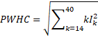
PlotXY gives this numerical index for any variable subject to Fourier analysis, without considering whether it is a current or not. Therefore it does not add any unit of measure to the figure.
6.4
Function plots
PlotXY not only allows power display of the contents of your variables, but also can manipulate your variables to obtain new ones and plot them. You can for instance sum, multiply, divide your variables. You can also take a function of your variables (see sect. Advanced function plots). Parentheses are allowed. In a way, we can say that we can create a function of your variables and plot that function. Because of this, this feature has been called “Function plot”
You
can also request the time integral of a variable or an expression. In this
case, the string you enter to define the function must begin with “int” and end with
“)”.
To define functions, you access your variables by a compact name built according to the following conventions:
· In general, the compact name indicates the file number and variable number with the scheme “f#v#”. For instance, variable number 5 from file number 3 has as compact name “f3v5”
· To indicate Variables from the Selected file (that is indicated by a “x” in the first column of the File list table) the file indication can be dropped. For instance the 5th variable from the Selected file can just be indicated ad “v5”.
Functions are defined by clicking on a cell in the “f” column of the File list table in the Data selection window. A small window will appear prompting you to introduce the string defining your function. It will have the following aspect:
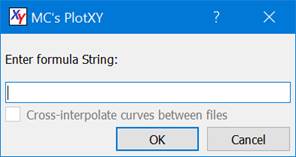
Note that the checkbox named “cross-interpolate curves between
files” in the current version will always remain unchecked. In the current
version of the program, that disabled checkbox has been introduced to remind
the user that no cross-interpolation will be done. This means that the
program assumes that in case of function of variables involving variables from
different files, the program assumers that all the samples refer to the same
time instants. Necessary (but not sufficient) for this is that the numbers of
points are exactly the same for all the files involved
in the same function of variables.
The allowed operators between variables are the following ones: +, -, *, /. As usual, * and / take precedence over + and -. Obviously, division requires care, since there might be division by zero. If division by zero is detected a dialog box will be issued and computation of the function of variable will be stopped.
Valid strings for instance are: “v9-v10”, “2*v1-v2/5”, “V1+1e3*v2”, “1e-3*v1”, “f1v1+f2v2+f1v3”, “v1-(v2+v3)”, “10*v9+20”, “int(v2+v3)”,. The latter example requests the integral between t=0 and the generic time t of v2+v3.
The first and last strings are used in the examples are shown below. The integral is shown in the same plot along with the function to be integrated for the maximum clarity.
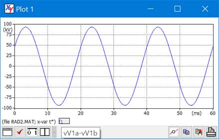
NOTE. The name of the function is just indicated as “f1”, “f2”, etc. However, to ease analysis, if the mouse is left above the variable name shown in the plot window, a full representation of the formula is shown as a tooltip.
For instance, in in the picture right below the mouse is left on “f1” in the plot window the user will see in a tooltip: “vV1a-vV1b”
In case a function of variable mixes variables from different files, each file is referred to as f#: f1 for file num 1, f2 for file num 2, etc. See next figure. Remember, as already noted, that the two files must have the same time instants at which the function is to be evaluated, and the program just verifies that the numbers of points are the same for all the involved files.
Another interesting example of function plots is shown below:
NOTES:
1. integrals are useful to calculate energy flows. For instance int(f*v) and int(u*i) will calculate the mechanical energy and electrical energy if f, v, u, i stand for force, speed, voltage, current respectively;
2. you can require integral of expressions, but not expressions containing integrals: int(5*v1) is correct, while 5*int(v5) is invalid. In other words, as stated earlier, in case of integrals the string you enter to define the function must begin with “int” and end with “)”.
Finally consider that also the x variable can be a function of variable. Compare the two plots below:
6.5
Advanced function plots
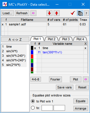
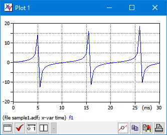
In addition to algebraic manipulation of variables, in more recent PlotXY versions you can also use a function of existing variables. Available functions are: sin(), cos(), tan(), sinh(), cosh(), tanh(), exp(), sqrt(), asin(), acos(), atan(), log(), abs(). If for instance you want to compare a quasi-sine wave resulting from a simulation with a pure sine wave, as mathematically determined, you can do this easily using function plots.
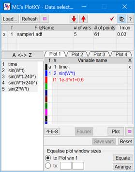
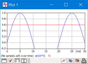
A few examples below
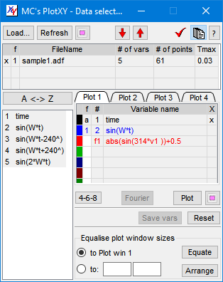
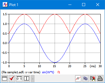
The following example uses a simple trick to add a horizontal row to a plot, to check values against a specific value. Here we want to check our plot against the value 0.6.
7 Working across sessions
PlotXY helps to re-enter rapidly the preferred working environment in new sessions with the possibility to save program state, to save Fourier settings, and to automatically load files. This is detailed in this section.
Customising the program behaviour allows more consistent experiences across sessions as well.
7.1
Saving Program State
When we work on PlotXY we load files, select variables, define functions, make plots.
When we close it, all this setup is in general lost. To avoid this, one can “save Program State” , i.e. the list of files loaded, variables and functions per file and plots shown, so that he can reload it again at a later time. The state is automatically stored in the Operating System’s program setting area (in Windows this is the Windows registry) and can be recalled at will.
To save the program’s state click on the “Save state” button on the main toolbar of The DataSelection Window.
Note that when working with PlotXY it may happen that a plot shows contents that does not correspond to the corresponding SelectedVar table. For instance we could select in the Plot1 SelectedVar table variables X and Y; plot them, and select a different set of variables without hitting the plot button again. When the program state is restored (clicking on the Load state on the Data Selection window), however plots always correspond to the corresponding SelectedVar table contents, as if the user has just hit the plot button.
As regards Fourier plot, PlotXY keeps trace of which plot table (e.g. “plot1”) is displayed when the fourier chart was last clicked. When reloading the state, if a single variable is present on that table, that variable’s fourier chart is drawn. This is done simulating a click on the “Fourier” button: therefore Fourier chart is done using the default settings (initial and final time, harmonics range, etc.).
NOTES:
· Fourier plots are not automatically generated when restoring the program state.
· The plot’s appearance (line vs bars vs dots, zoom state) is not stored.
7.2
Saving Fourier chart settings
While Saving Program State means to save which files are loaded and which variables and function plots (see section “Function plots”) are selected for each file, there are settings specific to Fourier Chart that can be saved from within the Fourier window itself.
When Fourier chart’s window “Save Settings” button is clicked the following settings are saved:
· whether the h-grid box is selected
· all the options selected in the “Fourier options”
Note that the first time in a session Fourier button is clicked, the interval in which to analyse the selected curve is automatically computed based on the default frequency in the Program options window, as follows:
![]()
Where tend is the final time of the current simulation, and f is the “Default frequency for Fourier Analysis” in Program Options window.
For any subsequent clicks, instead, the saved “Start time“ and “End time” are used.
Start and end time are not stored because these times are automatically computed when a Fourier chart is requested from the last part of the simulation: a period is estimated from the default frequency as specified in the Program Options window.
7.3 Automatic loading of files.
It may happen that you always (or very often) load the same files or files having the same name
In this case, in addition to the “save state” feature you have another option: specifying the files at command line.
If, for instance, in Microsoft windows you can create a link to PlotXY.exe in your folder containing “sample1.adf” and “rad2.mat” and writing in the program name after “PlotXY.exe” (without quotes) “rad2.mat sample1.adf” (without quotes). Your PlotXY will open and automatically load the two files.
You can list up to nine files as command-line parameters. They will all automatically load.
7.4
Customizing the program behaviour
We have already met in section named “Loading a file and doing first things” the “Program Options window.
There we saw the appearance of the “General” tab sheet. We also have other options to choose from in tab sheet named “Plot”, that is shown below here.
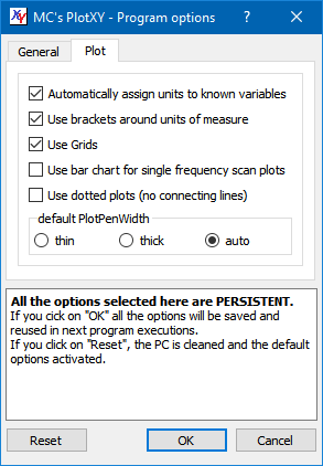
Their meaning is rather straightforward. Only the “Automatically assign units to known variables” might need some explanation and this is done in the following “Automatic Units of measure and prefix” section.
Note that when we hit the “Reset” button all program options stored on the PC, including program state (see “Saving Program State”)
And Fourier settings (see”Saving Fourier chart settings”) are reset, and the PC cleaned. At this point if PlotXY.exe is deleted, the PC is left totally cleaned of everything PlotXY has written on it.
8 Printing and exporting
8.1
Printing on paper or pdf
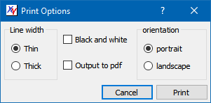
Plots can be printed on paper or pdf. The options at your disposal are those shown in the following diagram, that appears when you click on the “print” button of the plot window.
8.2 Exporting selected variables into a new data file
Very often files containing output from simulations or measure contain a lot of variables, while only a few of them are of interest for a given purpose.
PlotXY is able to create new files with such a subset of variables. Currently, however, saving only can be made from variables coming from the same input file. Thus, variables from different files or variables created using The “function of variables” feature, cannot be saved.
To export the selected variables into a new data file chick on the Save vars button of the in the Data Selection window.
Note that pl4 as output file type is only allowed when saving variables already belonging to a pl4 file. In this case the pl4 file created is of the so-called “pisa” format (or newpl4=2 format).
8.3 Exporting plot into system clipboard or SVG/PNG
Once you are satisfied with your plot you may want to export it somewhere.
Maybe you want to include it into a document file (e.g. Microsoft Word or OpenOffice writer): to do this you click on the Copy button on a Plot window, and then paste it into your favourite program. This way you get a pixmap copy (once called bitmap copy) of the plot.
As an alternative you can save you plots onto disk. In this case, you can obtain this result clicking, still in the plot window, on the Save plot button. You will get both a Portable Network Graphic (“PNG”) and a scalable Vector Graphic (“SVG”) plot copies on your hard disk. The PNG is a pixmap while SVG is a vector copy. The SVG has the advantage that it can be manipulated using a SVG editing program (such as the freely available Inkscape from www.inkscape.org or the commercial Microsoft’s Visio). In this way you will find that curves will remain curves (can be moved around as a single object, text items will remain text items, etc. Moreover, zooming can be done without loss of visual quality.
SVG files can be drag&dropped in Word 2016 or PowerPoint 2016. In this case, Word and PowerPoint keep a local copy of the created SVG, which can be edited using your favourite SVG editing program (e.g. Inkscape). If you edit embedded SVG plots, the edited plots are embedded independently on the original drag&dropped file.
Note that another way to have a picture on file of your plots is to use the Printing on paper or pdf feature.
9
How to use with OpenModelica
9.1
Basics
OpenModelica is a powerful tool to build and simulate simulation models built using the Modelica language. However, its plotting post-processing capabilities are much more limited than PlotXY’s.
OpenModelica users can take advantage of PlotXY to exploit its unique features, and in particular:
- mixing and plotting output variables through its Function Pots feature
- creating Fourier Charts (harmonic spectra).
There are the following ways for PlotXY to read OpenModelica outputs:
- reading the whole simulation output in mat format
- reading the whole simulation output in CSV format
- reading selected curves created from OpenModelica plots.
The
option 1 a d 2 are not advisable, when they are used PlotXY lists only the
variables actually on the mat and CSV files, which are
typically a small subset of the variables visible from inside OpenModelica.
This is because some variables are equal, or just changed in sign, and to save
precious disk space, in these cases, OpenModelica saves only one of them. For
instance, if an inductor and a resistor are connected to the same pin, that
pin’s voltage is saved just once; if in addition the resistor has its other
terminal grounded, that pin voltage is also the resistor voltage. In this case
it is possible that just one of the three variables are visible in PlotXY and
therefore ii is a bit tricky for the user to find the right variable to show
and postplot. This will change in
the near future, as an enhancement is programmed to overcome this
difficulty.
The option 3 is on the contrary very handy. Therefore, in the remainder of this section we’ll consider only this.
9.2
Fourier charts
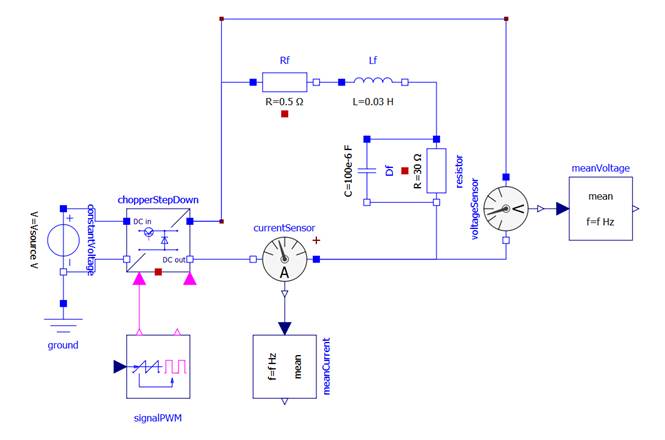
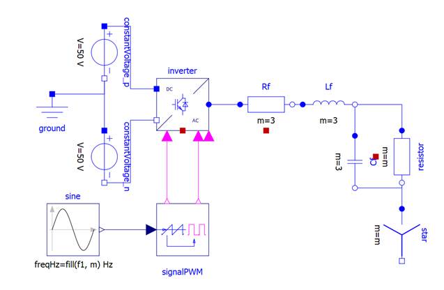
Consider the following simulation, drawn from Modelica.Electrical.PowerConverters.Examples.DCDC. ChopperStepDown.ChopperStepDown_R, with the interposition of a Lf-Rf-Cf filter between chopper and load, and the following plots:
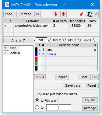
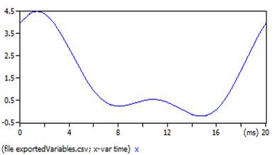
To transfer these two curves in PlotXY it is sufficient to click on the button having as icon “CSV”, and as description “Export Variables”. As regards the output file name, in most cases it is advisable to keep the predefined value “exported values.csv”. Different names could be convenient in case we want to export data from different plots into different files.
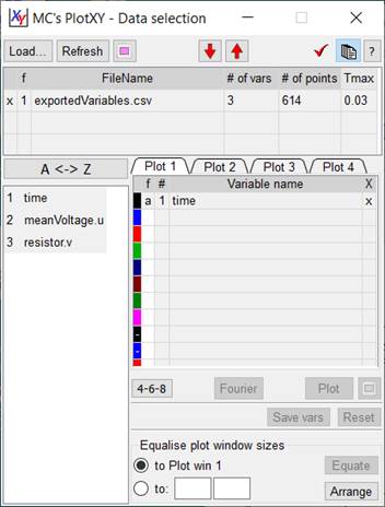
At this point the file exportedVariables.csv can be loaded in PlotXY, just dragging its name on the PlotXY window which we suppose it had already been opened.
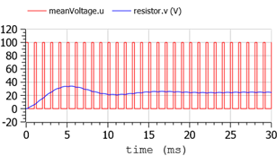
Once the file is loaded, we select the two curves (clicking on their names) and do the plot. We get the following windows:
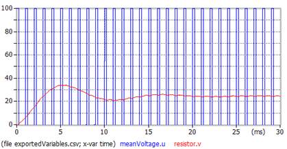
Note that the number of points is 614, while the model requires just 500. This is due because OMEdit adds a few more points when converter commutations (“events”) occur. So, we must expect curves with non-equally spaced samples. If we want to perform a Fourier analysis, therefore we must choose an algorithm that does not take as granted that the samples are equidistant. PlotXY does this, and therefore is able to compute Fourier series coefficients with good accuracy also in these cases.
However, to perform a Fourier analysis of these curves 500-600 samples are too low. We repeat the simulation with 5000 intervals, and we get actually as output 5154 values.
Below you can see the harmonic contents of the two curves, unfiltered and filtered respectively. Since the converter operates at 1000 Hz, the interval of analysis is the last millisecond of the simulation, and therefore bars are 1000 Hz spaced. Any details on the use of Fourier chart window are reported in sect. Creating and managing Fourier Charts.
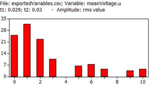
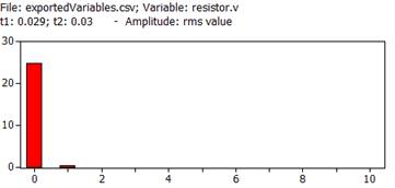
It is easily seen that the filter effectively reduces the harmonic components.
9.3
Fast update of
PlotXY display
One we’ve loaded OME variables into PlotXY, it is very easy and fast to update them. This is very effective when we do re-simulate. If we do this e.g. in the previous example for instance modifying the converter duty ratio, value from 0.25 to 0.65, after clicking re-simulate we click again on CSV to update the CSV file (leaving the CSV name unchanged, e.g. exportedVariables.csv), and just “refresh” on PlotXY the curves are automatically loaded and plotted, in their updated version.
9.4
Combination of variables (Function Plots)
Consider the following simulation, drawn from Modelica.Electrical.PowerConverters.Examples.DCAC. MultiPhaseTwoLevel.MultiPhaseTwoLevel_R, with the interposition of a Lf-Rf-Cf filter between chopper and load:
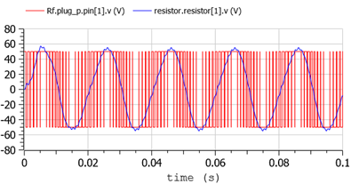
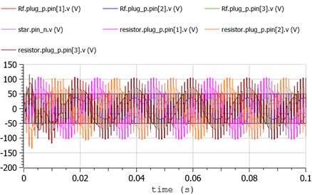
The effect of filtering is apparent in time domain, for instance with the following plot.
Let us suppose that we want to compare the voltages at the positive plug of Rf taken with refence with the star pin, instead of the ground. This model does not allow this directly: to do this comparison we must modify the model, e.g. adding voltage sensors. This is not always possible of convenient. It can be done, instead, as a post-processing activity through PlotXY. Another example of variables of interest, and not directly available, is the line-to-line load voltages.
To do this first we prepare an OM plot with the variables we want to post-process, as follows:
We export this using the CSV button and load the CSV in PlotXY:
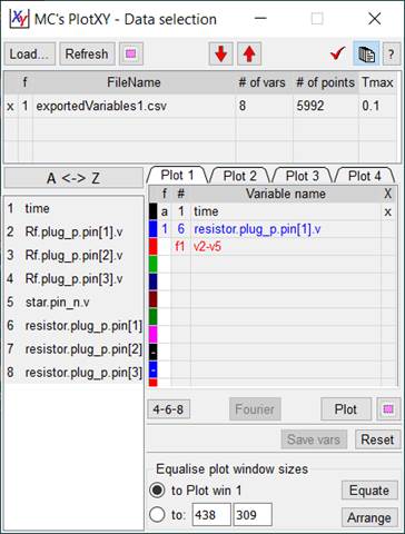
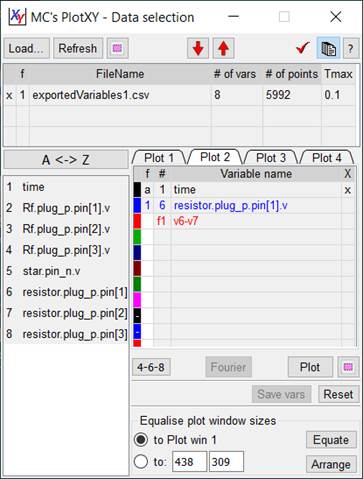
As in the previous case, even though 5000 intervals
were requested, OM has chosen 5992, since has hadded some more at events.
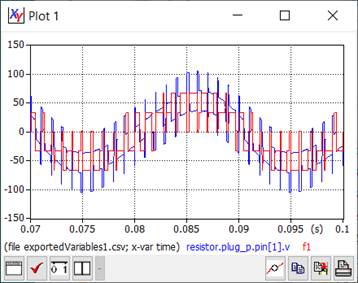
PlotXY post processing capabilities are much more than
this: you can create the product of variables, the integral of a variable or
mixture of variables, etc.. Details in the section Postprocessing of this document.
What else?
In this tutorial you have learnt all the major things you can do with PlotXY. You can learn the rest just by trying.
However, there are specific details on the structure of adf file or the rules that the program use to convert variable names into the supplied formats: for instance not all the names that are valid as ADF file or pl4 file names can be used as such in matlab files.
This more advanced documentation is provided document: “Input formats and naming conventions.pdf”
10
Additional information
10.1
Management of the plot windows.
PlotXY has a special architecture, which creates individual windows for individual plots, which are also separated from the main window, the DataSelection Window. When working on a cluttered desktop, it may happen that some of the plot windows finish below other windows (from other programs running).
To put on top of the desktop all the active plot windows, just select the DataSelection window, clicking on it.
On the other hand, to have in the DataSelection window the tab corresponding to a plot window to be displayed, select a plot window (or a Fourier window) clicking on it. This feature is called auto tab-switch.
PlotXY is multiple-screen aware. If the system on which it operates has an extended screen, windows can be put on it, and saved. However, if when the program is restarted the extended screen is not available anymore, windows are moved into the primary screen so that they are visible and manageable.
10.2
Automatic determination of scale span
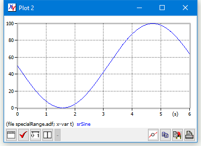
PlotXY contains an algorithm to determine automatically the span of the variables on the axes in such a way that the actual plot covers a large part of the plot rectangle (at least 80%) and the number on the axes are “round”, i.e. they contain the least possible significant digits.
The following table, for instance, contains the axes extrema, which are computed with given minimum and maximum values of the displayed variable.
|
Actual extrema |
Rounded
extrema |
||
|
Min |
Max |
Min |
Max |
|
0 |
1.05 |
0 |
1.2 |
|
-1.05 |
1.05 |
-1.2 |
1.2 |
|
-1000 |
10 |
-1000 |
200 |
|
0.555 |
0.6 |
0.55 |
0.6 |
|
-0.007 |
100 |
0 |
100 |
|
|
The last row in the table is a special case: the software cannot
find round extrema to contain the whole plot, but
finds very nice ones that contains the (by far) large majority of it. In this
case, he makes this choice, but signals this fact, using a grey-tick line for
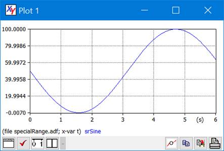
the plot rectangle, as shown aside here. In this case, however, if the user clicks on the “Change Scale”
button, he will have the opportunity of seeing the plot with the full ranges
on the axes (figure below – left). However, in the case the purpose of
showing “round” numbers on the axes is given up. (figure below right). |
|
|
|
Note that not only the program chooses round numbers on the extrema, but also selects the number of tic-marks in such a way that the numbers on them are as round as possible and the number of them is reasonable, depending on the window’s size. The user is prompted to experiment with this feature resizing the same plot and seeing how the intermediate tic-marks change in number. A tiny plot can have numerical labels just at the two extreme values.
10.3
Automatic Units of measure and prefixes
You may have noticed that in come plots units of measure (such as (V) or (kV)) have appeared.
This by default is automatically done by the program based on the following simple rules:
The “prefix”, substitutes the powers of ten, according to the standard notation, shown for completeness in the following table:
|
prefix |
meaning |
prefix |
meaning |
|
p |
x10-12 |
k |
x103 |
|
n |
x10-9 |
M |
x106 |
|
u |
x10-6 |
G |
x109 |
|
m |
x10-3 |
T |
x1012 |
The units of measure are chosen as a function of the first character of the variable name, according to the following table:
|
name begins with |
assumed unit |
symbol |
name begins with |
assumed unit |
symbol |
|
‘v’ |
volt |
V |
|
|
|
|
‘c’ |
ampere |
A |
‘i’ |
ampere |
A |
|
‘p’ |
power |
W |
‘e’ |
energy |
J |
|
‘t’ |
time |
s |
‘f’ |
frequency |
Hz |
Note that the unit “s” for variables starting with “t” is used for horizontal-axis variables only
You can disable this feature unchecking the “Automatically assign units to known variables” check box in the Program Options|Plot tab sheet (cf. section “Customizing the program behaviour”.
10.4 More on loading files
In section Loading a file and doing first things it was said that loading files can be done either using the Load… button, or dragging files on the Data Selection window. Here I supply some more details.
With both techniques, you can load individual files or groups of files. The program will adapt to different situations and behaves as expected. At the end of load operation more than one file is loaded, the program is in multi-file mode (it goes into this mode if it was in single-file mode).
However, when individual files are loaded starting from single-file mode, the program behaviour depends on whether the action is initiated from single-file or multi-file mode:
· when starting from multi-file mode the new loaded or dragged file is added to the already loaded ones
· when starting from single-file mode, the new loaded or dragged tile replace the currently displayed one.
It is recommended to try these differences: once you get accustomed, you can take advantage of them.
11
What else?
In this tutorial you have learnt all the major things you can do with PlotXY. You can learn the rest just by trying.
However, there are specific details on the structure of adf file or the rules that the program use to convert variable names into the supplied formats: for instance not all the names that are valid as ADF file or pl4 file names can be used as such in matlab files.
This more advanced documentation is provided document: “Input formats and naming conventions.pdf”